Creating the perfect "Care" logo
Care providers with strong branding are the ones most likely to find success within the very competitive Australian care industry, regardless of their size. In the past decade, the number of companies in the sector have tripled, making it a fiercely competitive landscape.
Whether it’s a service providing care to aged consumers, people with a disability, or children, a professional logo design should form the cornerstone of a successful marketing strategy.
You want your logo to be clear. To engage with consumers. And to showcase the “humanistic” side of your business.
You want to show that you “care.”
The Graphics
In terms of graphics: icons and symbols paired with text are the common logo components in the Care Sector. An icon or symbol should have a strong impression in the minds of viewers and draw them closer psychologically.
Popular choices for the care sector are heart icons, as well as abstract symbols depicting freedom or independence. Our role as logo designers is to think outside the square and develop something unique & memorable that resonates with the intended audience.
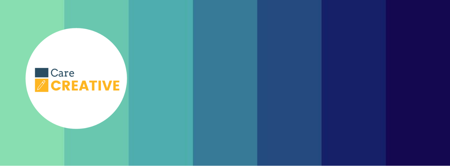
The Colours
The care industry promotes a sense of nurturing, healthy living and security, as such, blues and a range of greens are commonly used by logo designers.
Oftentimes, these are light in saturation to relay comfort and avoid a feeling of acuteness or harshness. You see very few care logos in red, with this colour usually associated with a sense of danger and caution.
The colours used in a care logo should compliment each other to maintain an overarching unified message or concept.
The Font
Yes. Fonts do matter.
Choice of font reflects your business identity, as well as the respect you have for your audience.
In the care sector, font clarity and ease of legibility are core factors to be considered. A font that is difficult to read does not set a business tone of approachability and dependabilty.
When choosing a font for a client – I always give it “the bus test”. Could I read the font on a passing bus and have enough time to understand the business values behind it?

Kathy Bellingham
Kathy Bellingham is a Design & Marketing Specialist with CareCREATIVE. To contact Kathy, about gettting your logo designed or updated please call 1300 09 09 55 or email info@carecreative.com.au